ProStuff lets you find relevant information for the products that matter to you
Learn More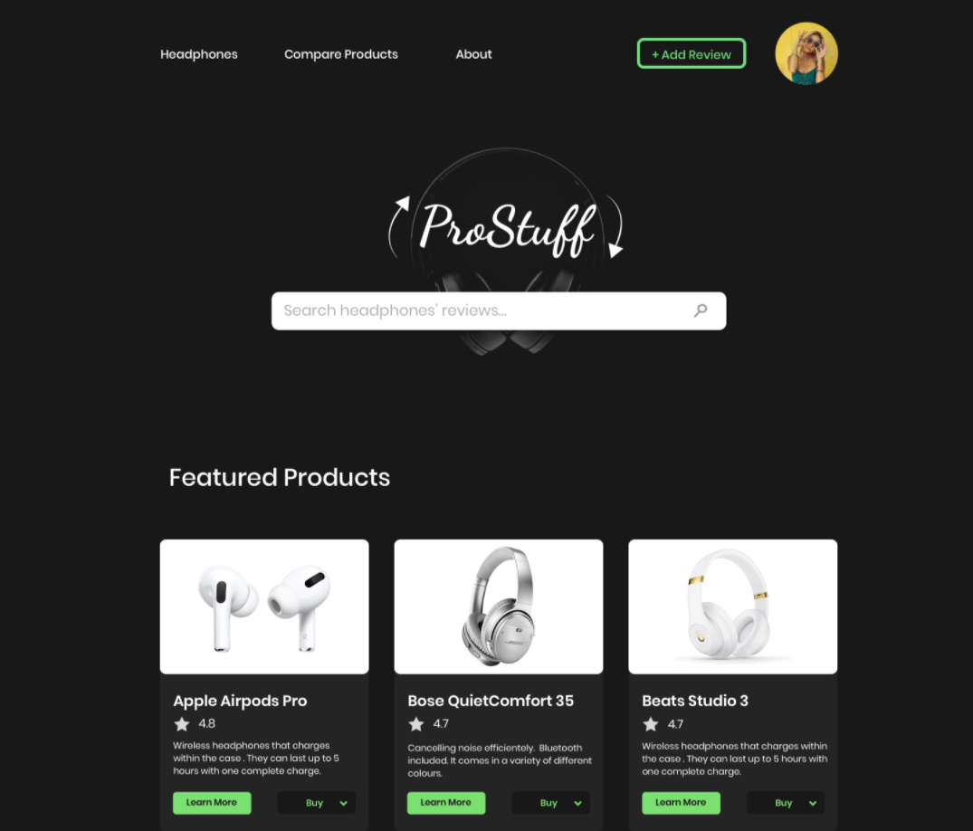

OVERVIEW
PROSTUFF WEBSITE'S PROTOTYPE. DO YOUR RESEARCH IN ONE PLACE
Today, whenever we buy a product, we either spend a lot time doing research or we rely on a recommendation from an acquaintance or a stranger online. Even then, the results can be disappointing.
ProStuff is an informational and review aggregator website that wants to help resolve this issue by providing people with useful information to make an informed purchase according to their needs. The purpose of this website is to ease the research process of buying a product. This prototype in particular will focus on headphones while leaving room for future expansion.
The website will show recommendations from users with similar wants and needs as the person reading the reviews. These recommendations will be shown by displaying the written review of the user and a score. The system review will grade specific aspects of the product such as their price, quality, customer service, among others.
...
PROBLEM AND SOLUTION
MY PROBLEM STATEMENT AND PROPOSED SOLUTIONS
The reasoning behind this project came when I was trying to purchase a mattress. When I asked the people close to me, they didn’t really know enough about the industry to provide any recommendations. After that, I decided to do some research online, but the reviews that I found were very polarizing. Not having someone knowledgeable or reliable information online presented a few problems for me. This made me realize that we as consumers often face similar problems:
The website intends to change this by putting all the information together about well-known or hidden-gem products, a link to their marketplace, the characteristics that make the product a good fit for the user. This will be available for anyone to read or to contribute with their own reviews.
...
ROLES & CONSTRAINTS
MY RESPONSIBILITIES AND THE DIFFICULTIES THROUGHOUT THE PROJECT
I worked on the survey and findings, user personas, brand guidelines, wireframes, UI screens and on the final prototype.
...
AUDIENCE
RESEARCH AND USER PERSONAS
After performing an analysis of the possible users for the website, my findings show that they had the following characteristics:
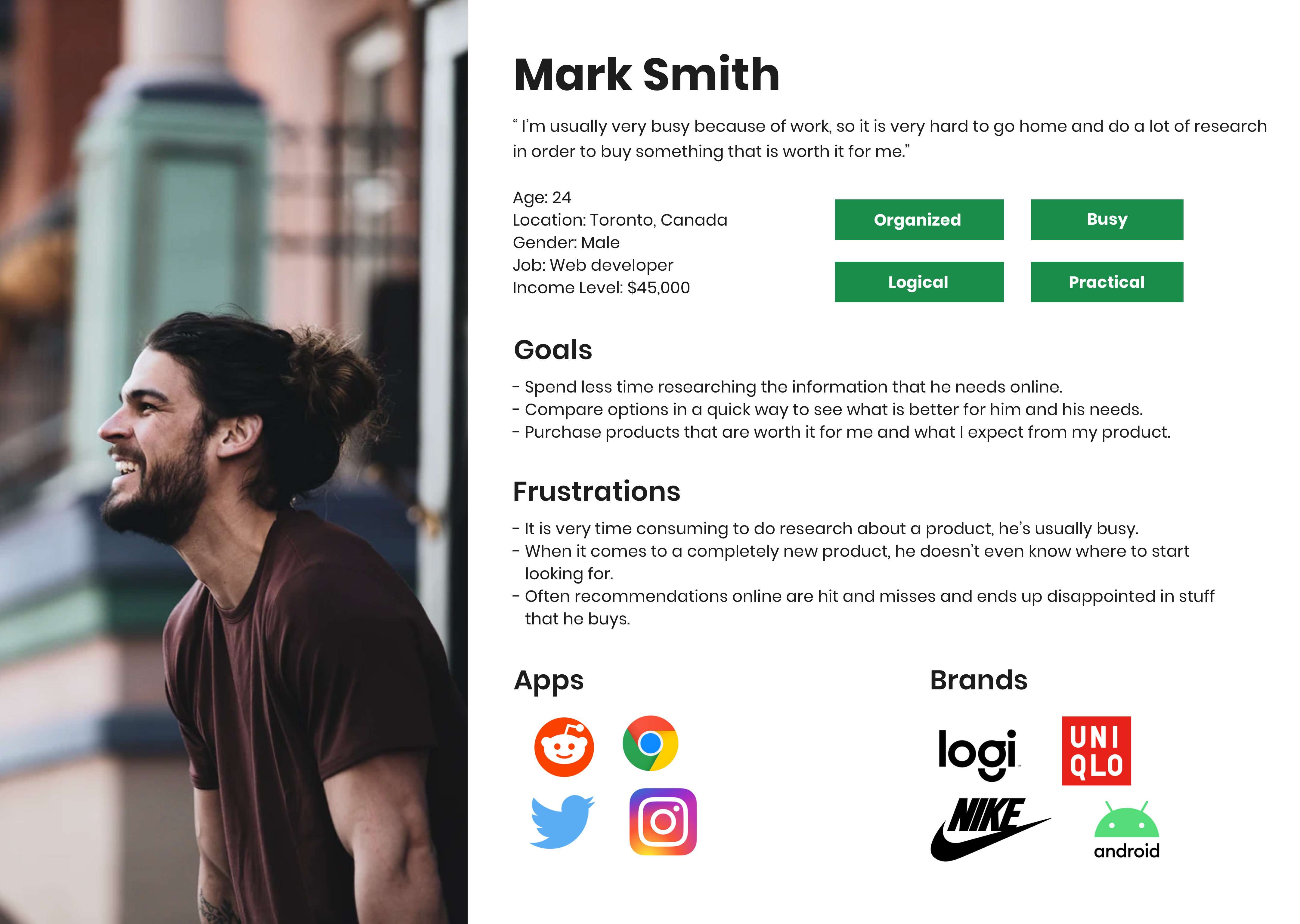
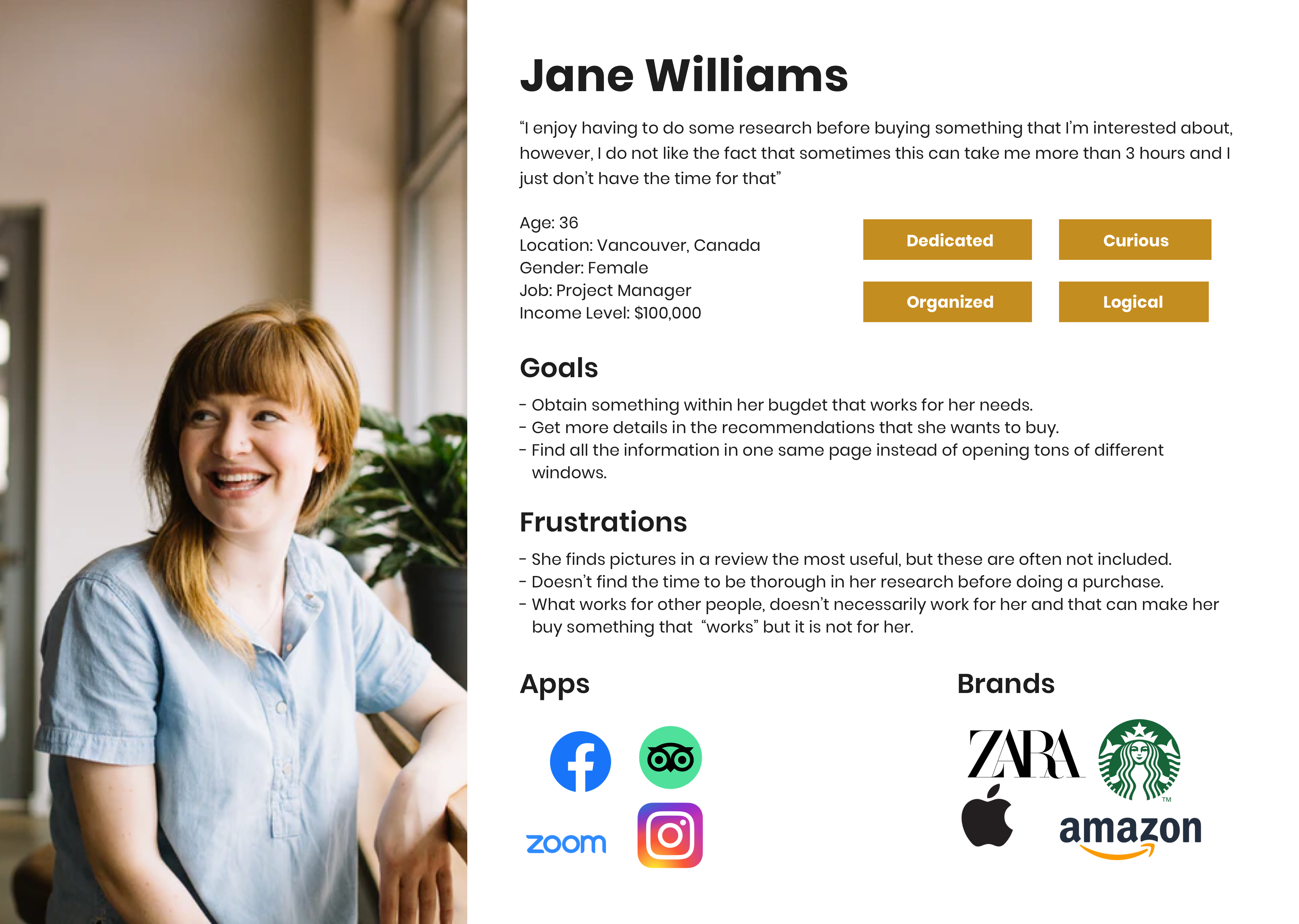
I also worked on user personas to represent the three user identities. One being a recent-graduate that worries about his budget, an older professional that has limited time and the last one who despite having a lot of time available, is less knowledgeable of tech.
...
UX RESEARCH
SURVEY & FINDINGS
Doing UX research was crucial in the better understanding of the users’ concerns and their needs. When designing and executing the survey, I asked questions related to their previous experiences with online shopping, researching products, online reviews and the features that they would appreciate in a website like this.
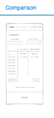
Based on their responses, I made some changes to the website, such as focusing on things that they considered to be more useful, such as having the ability to compare products. This was very useful because it allowed me to include a comparison tab feature, which is something that had not been considered in the initial iteration of the app.

...
UX DESIGN
WIREFRAMING & SKETCHING
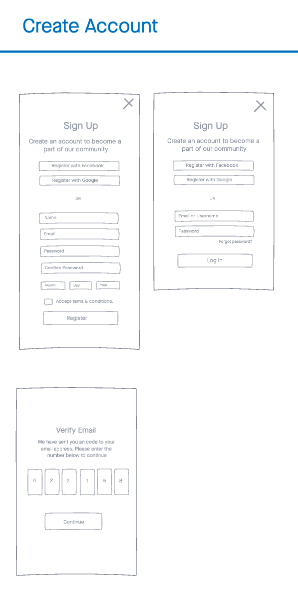
After receiving and analyzing the results from the survey, I started working on the wireframes. For this process, I started sketching some basic wireframes on paper and ended up working on low-fi wireframes on an Invision Freehand.

...
UI DESIGN & PROTOTYPING
UI SCREENS, BRAND GUIDELINES & ACCESSIBILITY
Once the wireframes were finalized, I started working on ProStuff's guidelines. I started experimenting with a couple of designs with the use of different colours, fonts and icons to see which style I preferred overall.
After choosing the final aesthetic, I moved on to work on the UI screens. These can be seen available in the prototype above. The UI screens were completed using Sketch. Symbols were a really important aspect on making this design step as fast and efficient as possible. Accessibility was the priority in choosing colours and font sizes. All colours passed the contrast ratio score for large and normal text.
Finally, the prototype was made using the Invision prototyping tool that would help the user navigate throughout the website. Opening an account was made mandatory at the beginning of the prototype since I wanted to showcase it to its full-potential with all the features available.
...
CONCLUSION
OUTCOMES & LESSONS
ProStuff is currently a prototype that shows how the website would work if it was deployed online. Throughout this project, I learned about the importance of having a solid plan before starting to work on it. Every time I tried to skip some steps or move ahead to more important deliverables, I often found myself having to work double the amount or just having to redo everything from scratch.
Having said that, I found that my strengths in this project were that I had good time management skills, knew what was feasible with the resources I had available and I felt great sympathy towards my audience. Since I already had experienced the struggles that the project would solve, a user-centered approach was the most appropriate way of designing it.
Moreover, the fact that I have worked in projects that involved UX and UI processes in the past, gave me an important understanding of how to create this prototype. Moving forward, I would like to see more products added, more refined features and a developed version so that people are able to interact with it even more appropriately.